How the Spud Bud Brand Was Created: A Story of Design and Identity

When Spud Bud Croatia began developing its brand, the goal was to create a recognizable, modern, and friendly identity that would clearly communicate the quality and character of its products. To bring this vision to life, the entire visual identity development process was entrusted to Rineo, a creative agency based in Zagreb.
From the initial concept to the final visual solution, Rineo developed a unique creative direction that became the foundation of the Spud Bud brand. The process included:
-
Name creation – a distinctive, simple, and memorable name that reflects the brand’s playful and approachable character.
-
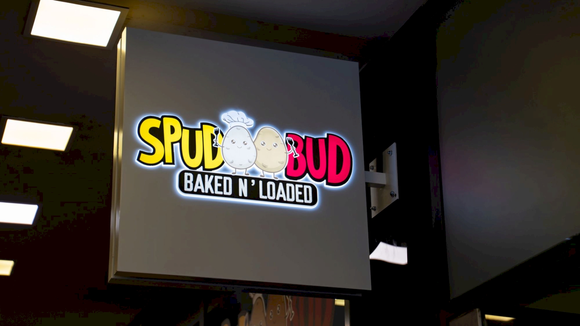
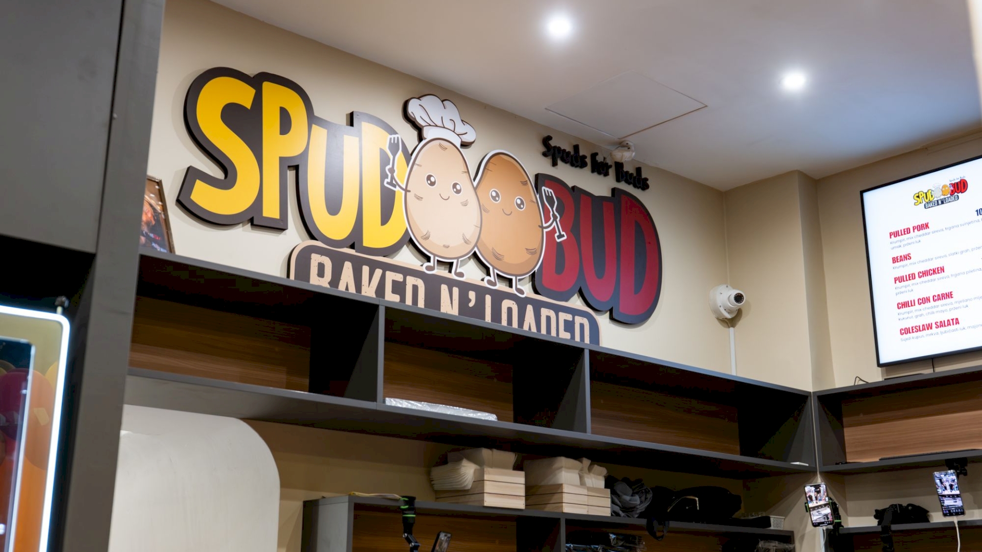
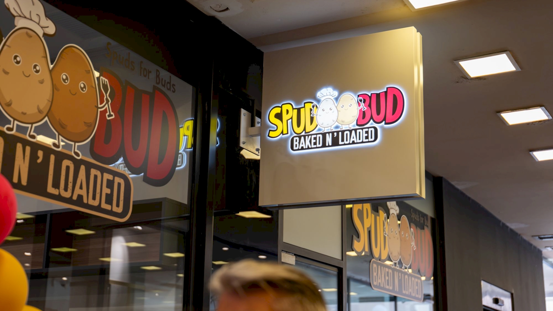
Logo design – a visual that combines modern typography with striking graphic elements, creating an identity that stands out in its category.
-
Development of the complete visual identity – defining brand colors, typography, design elements, and the overall visual tone of communication.
-
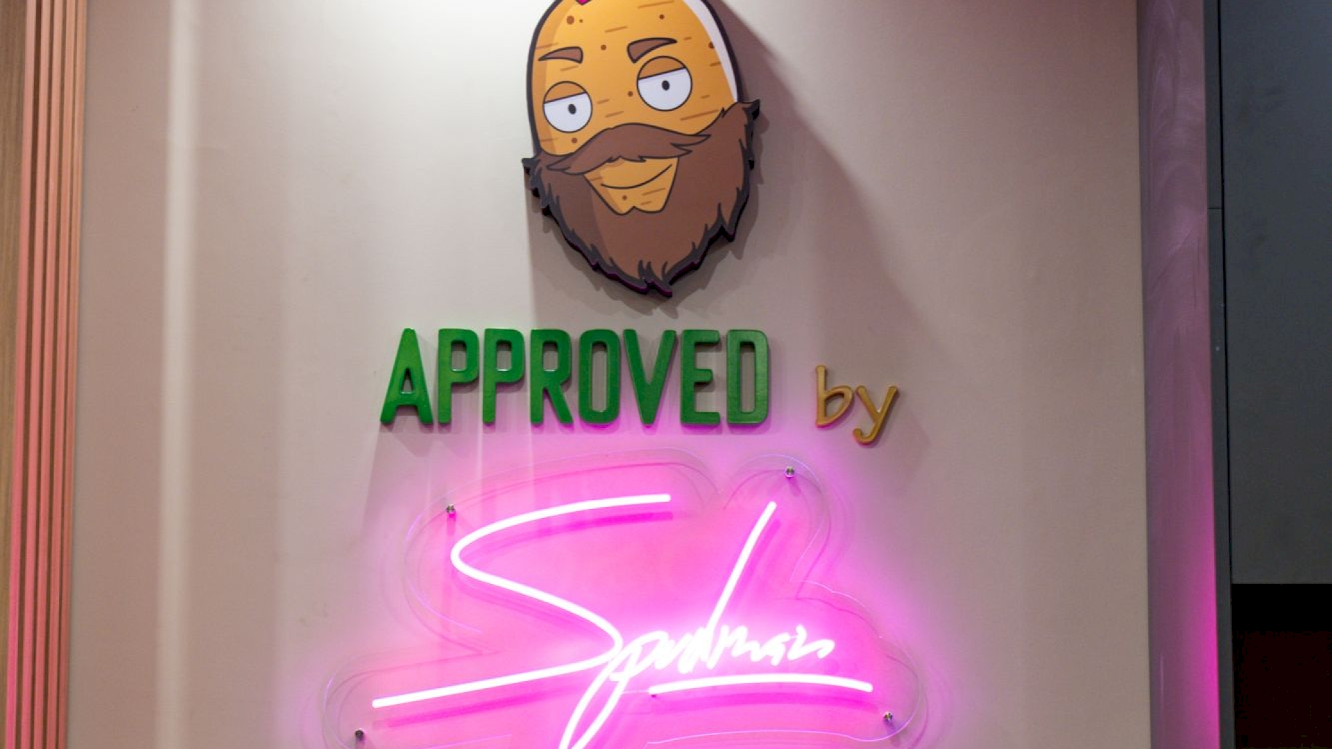
Creation of advertising and promotional materials – graphic solutions for advertising, packaging, and digital platforms, all aligned with the brand’s recognizable style.
The result of this collaboration is a brand identity that is consistent, appealing, and flexible enough to grow alongside the product. Today, Spud Bud Croatia can proudly present a visual identity that clearly communicates who they are, what they offer, and what sets them apart in the market.